Key Takeaways
- Accent the wall behind your bed, never the first wall you see or a wall split by a door.
- Skip heavy dark colors in rooms with little light; warm mid-tones keep small spaces open.
- Stop the accent color at the wall line so a crisp white ceiling keeps the room feeling tall.
- Use matte finishes and warm light so the color stays soft, deep, and dimensional.
- Balance one bold wall with layered textiles and properly scaled, oversized art.
- Stick to one hero color plus two neutrals instead of three or more competing tones.
- Choose a calm color you already love, not a loud trend you’ll want to repaint soon.
You add an accent wall to give your bedroom character, then somehow the room feels boxed in. The wall is usually the culprit. Small accent wall mistakes can shrink a space fast, even when the color looks great on the chip.Below you get 22 specific errors that make a bedroom feel smaller, plus the easy fix for each one. No vague advice, just the exact moves to avoid.Read these before you tape your edges. The right wall opens a room up, and dodging these mistakes keeps your space feeling calm, balanced, and bigger than it is.
1. Painting the Wall You See First Instead of the Wall Behind the Bed
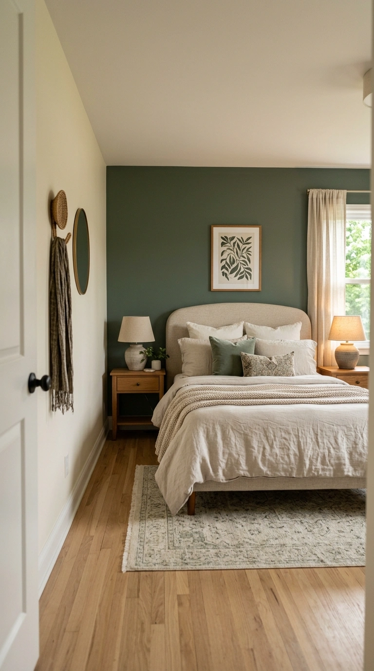
The first wall you see is rarely the right focal point. When you accent it, your eye stops at the entrance and the room feels short.Move the color to the wall behind your headboard. The bed anchors it, the eye travels deeper, and the room reads longer.
Fix: paint the headboard wall in deep sage or charcoal and keep the entry wall warm ivory.A clear focal wall Behind the bed makes the whole room read longer and calmer.
2. Choosing a Dark Color in a Room With One Small Window
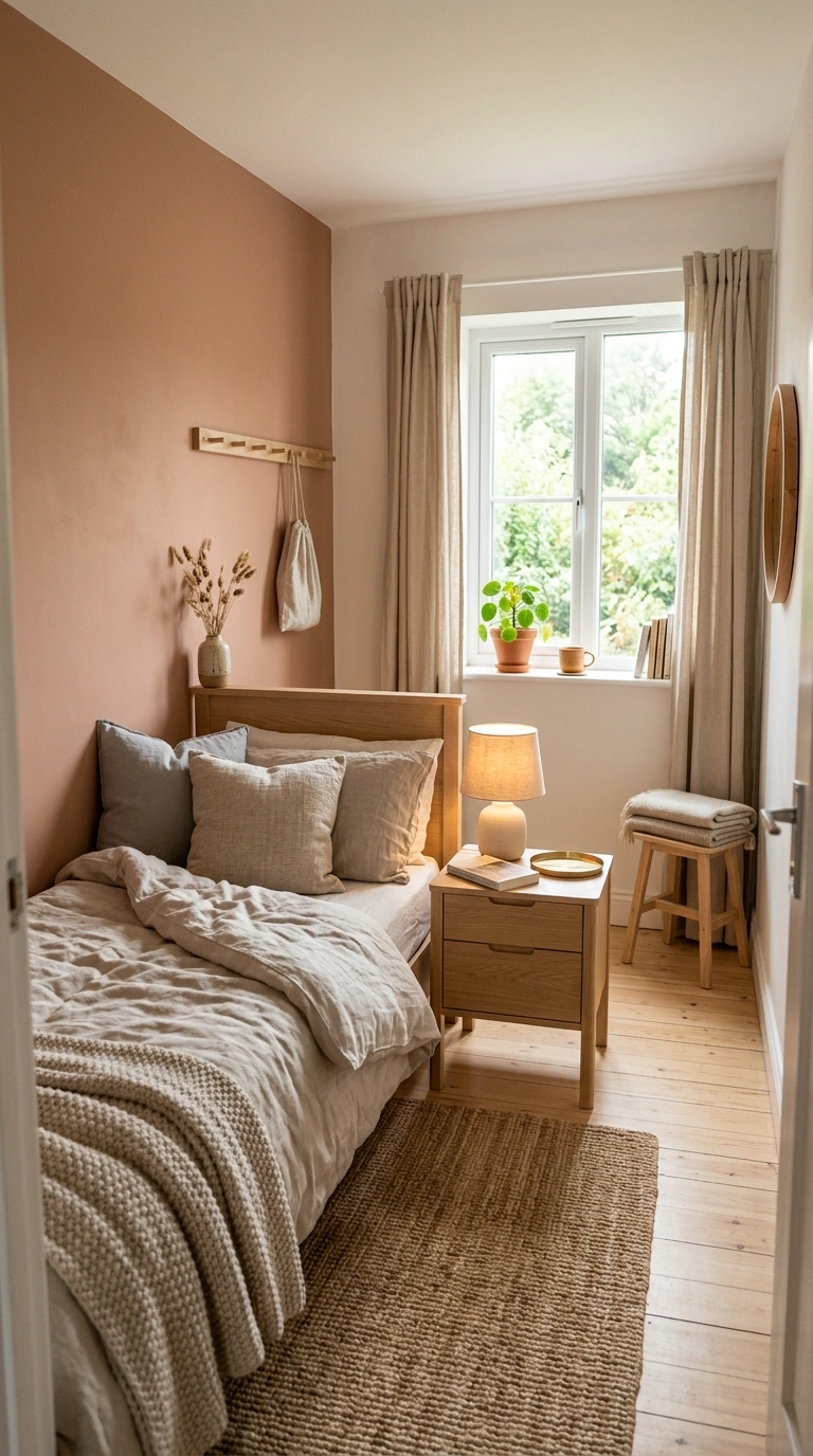
A heavy color soaks up the little light a small window gives, so the walls press inward and the room shrinks.Pick a warm mid-tone like soft clay or muted olive instead. These hold color without swallowing light.
Fix: reserve inky navy or near-black for rooms with strong daylight or several windows.Warm mid-tones reflect the little light you have instead of swallowing it.
3. Using a Cold Gray That Drains the Room’s Warmth
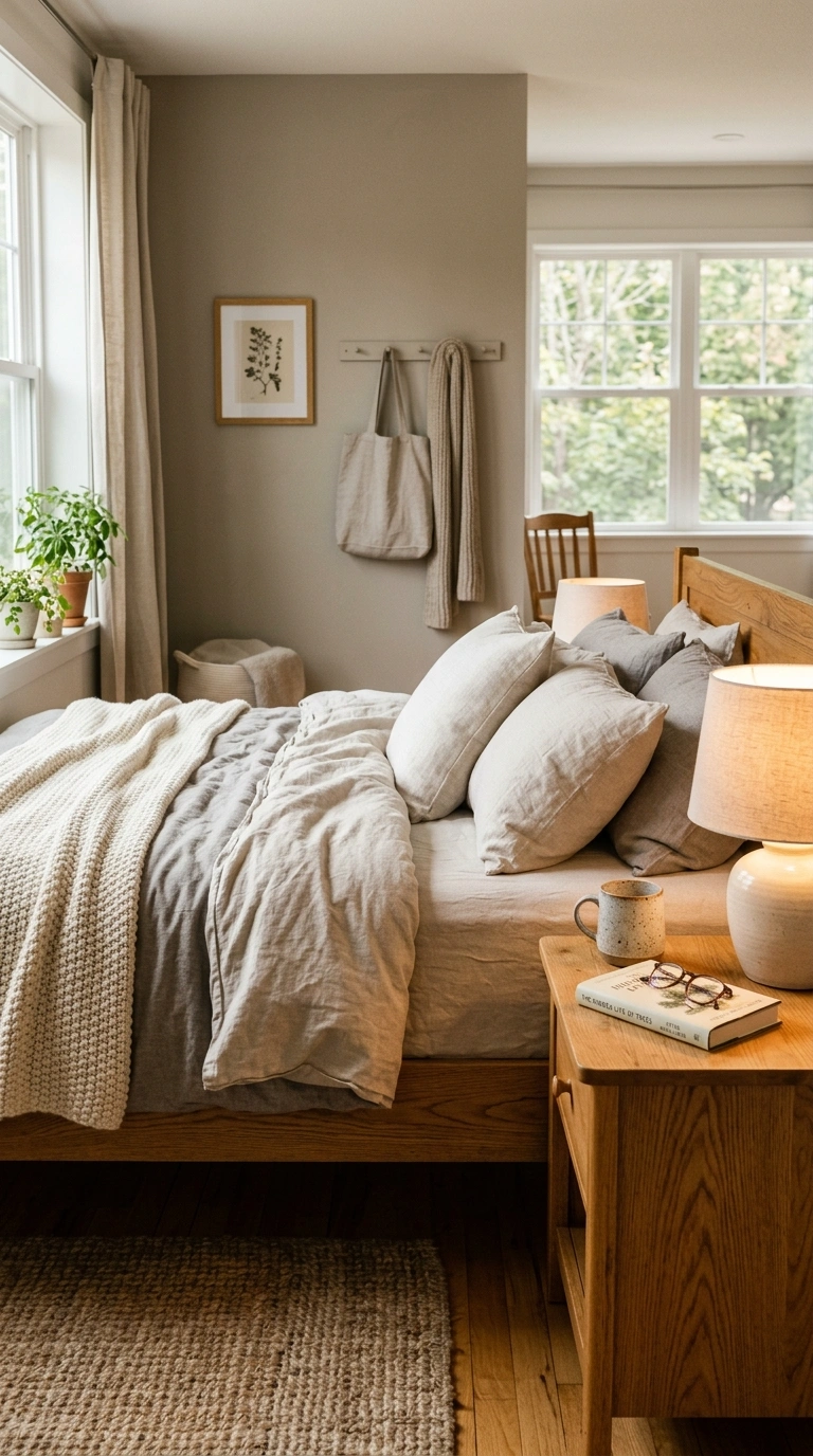
Flat, cold gray reads like a cloudy sky and makes a bedroom feel hard and smaller, not cozy.Swap it for greige, mushroom taupe, or a warm gray with a soft brown base. These tones hug the space.
Fix: hold the chip next to a warm wood floor; if it looks blue or dead, choose warmer.A warm undertone keeps the bedroom feeling like a cozy retreat, not an office.
4. Picking a Busy Pattern That Never Lets Your Eyes Rest
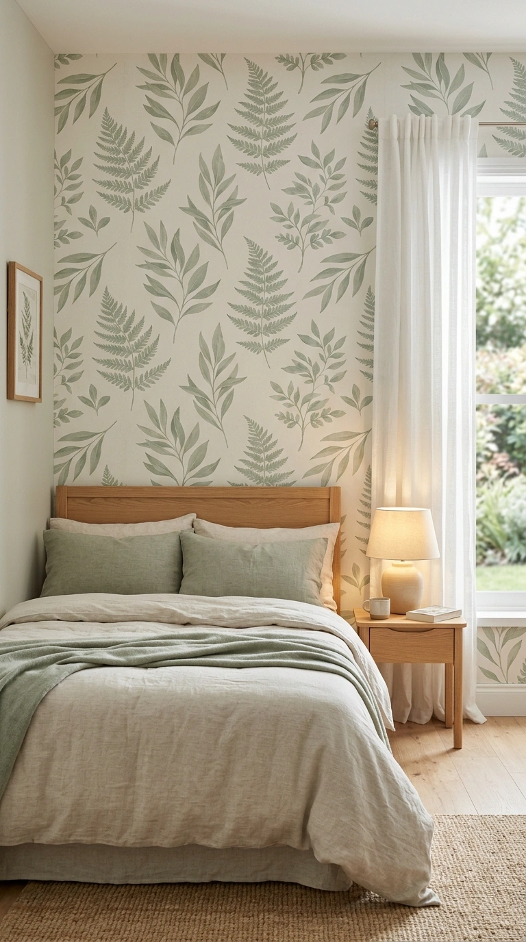
Tiny, high-contrast repeats buzz on a big wall and crowd the room visually, even when the floor is clear.Choose a soft, large-scale pattern like a hand-drawn arch or a loose sage botanical with breathing space.
Fix: stand six feet back from a wallpaper sample; if it vibrates, size up the motif.Soft, open patterns let the room breathe and your eye relax at night.
5. Running the Accent Color Onto the Ceiling Too Soon
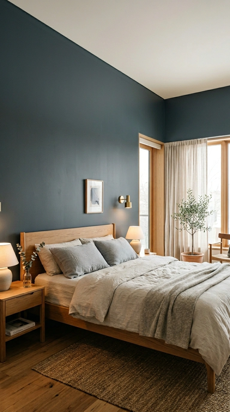
Carrying a dark wall color straight onto the ceiling drops the ceiling visually and makes the room feel like a low box.Keep the ceiling a clean warm white so it floats and the room breathes upward.
Fix: stop the color at the wall line, or add a thin warm-white reveal at the top.A floating white ceiling tricks the eye into reading more height overhead.
6. Adding a Glossy Finish That Bounces Harsh Light
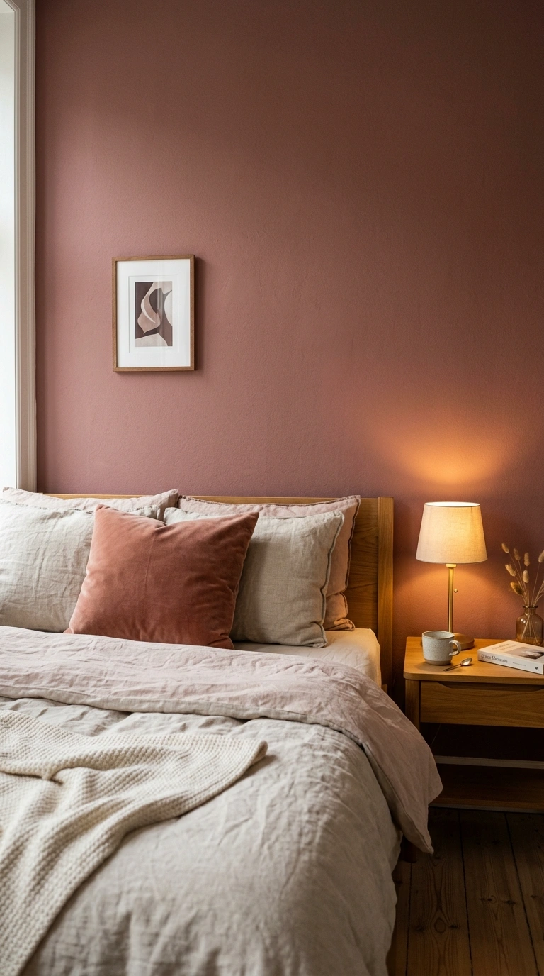
High-gloss paint throws sharp reflections that flatten the wall and show every bump, which makes the space feel cheap and tight.Use a matte or eggshell finish so the color stays soft and deep.
Fix: choose matte for color walls and save satin only for trim.Matte paint keeps the color deep and even from every angle in the room.
7. Choosing a Wall That Fights Your Flooring
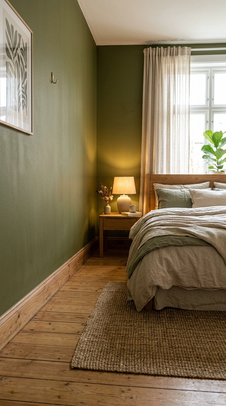
An accent color that clashes with your floor splits the room into uneasy zones, so the eye stops and the space feels chopped.
Pull an undertone from the floor. Warm oak loves clay and olive; cool gray plank loves slate blue. x: lay the paint chip on the floor before you buy.Tying the wall to the floor’s undertone keeps the space reading as one calm zone.
8. Forgetting to Test the Color in Evening Light
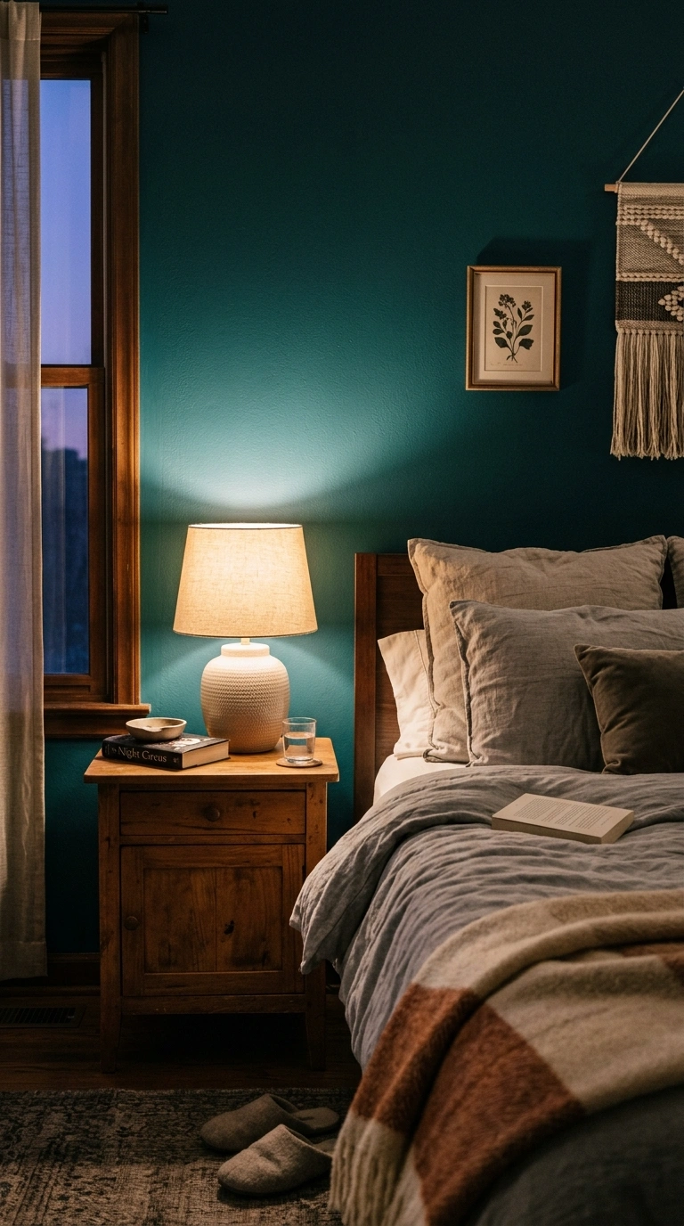
A shade that glows at noon can turn muddy and heavy under a warm lamp, which shrinks the room exactly when you use it most.Test the color at night with your real bulbs on.
Fix: tape a large swatch up for three evenings and judge it after dark.Evening is when you live in the room, so judge the color then, not at noon.
9. Crowding the Accent Wall With Too Much Furniture
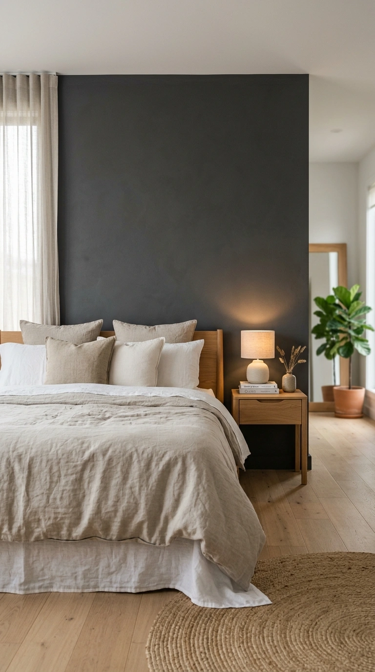
A tall dresser and stacked shelves against the bold wall hide the very feature you paid for and pack the room tight.Let the accent wall hold only the bed and a slim nightstand.
Fix: move bulky storage to a neutral wall and keep the focal wall open.An open focal wall lets the color do its job and the room feel larger.
10. Hanging Tiny Art on a Big Bold Wall
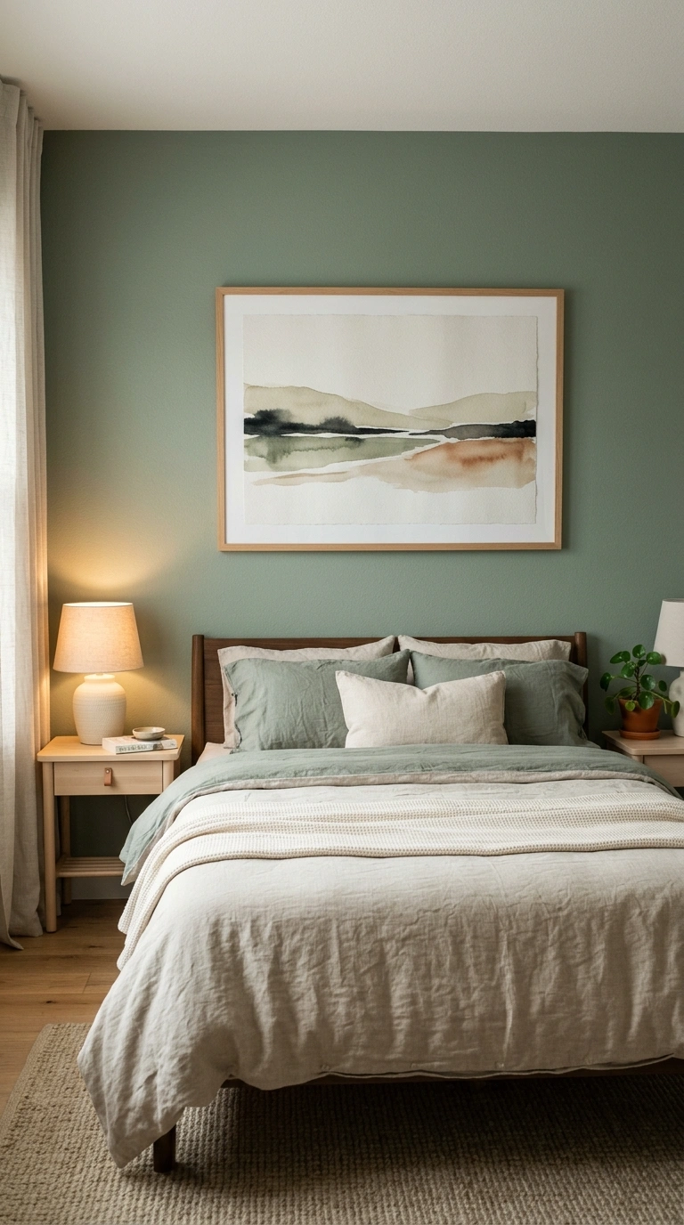
One small frame on a large saturated wall looks lost and makes the wall feel even larger and emptier.Scale up with one oversized piece or a tight pair that fills two-thirds of the headboard width.
Fix: match art width to roughly the width of your bed.Big art on a big wall balances the scale and grounds the bed below it.
11. Using a Strong Color on the Longest Wall
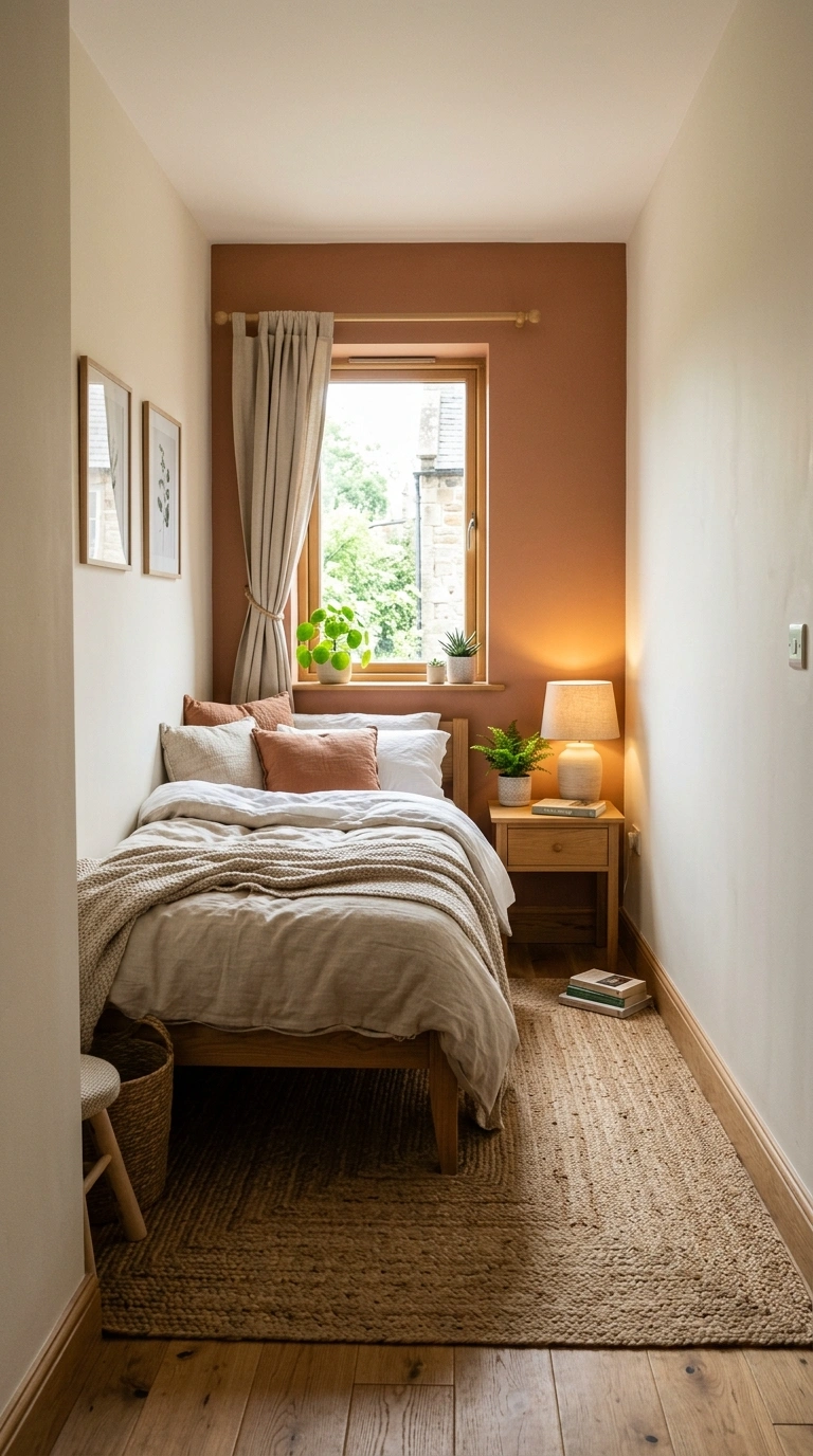
A bold color on the longest wall pulls that wall forward and makes the room feel narrow and corridor-like.Accent a shorter wall instead so the proportions even out.
Fix: in a long, narrow room, color a short end wall to square the space visually.Squaring the proportions with a short-wall accent stops the corridor effect.
12. Picking Three or More Accent Colors at Once
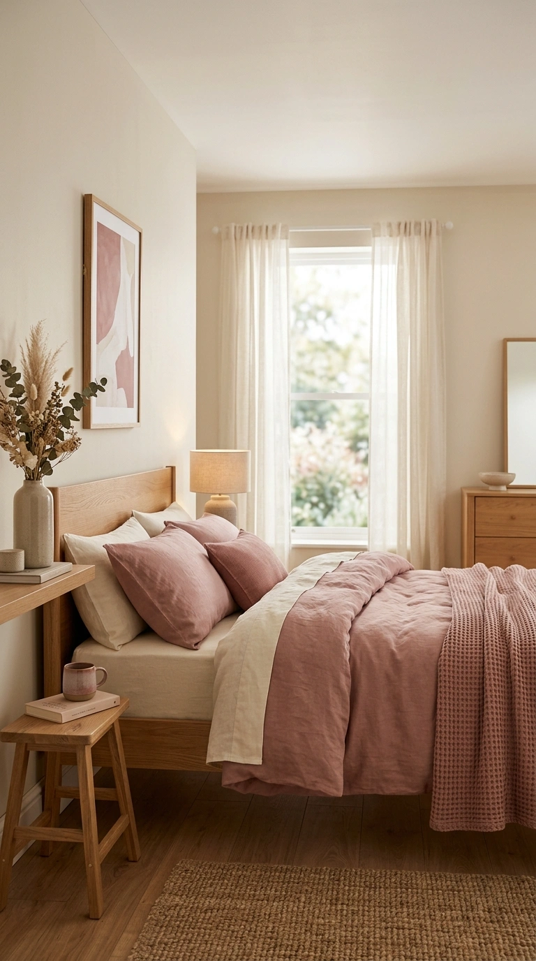
Several bold colors break the room into busy blocks, and busy reads as small and cluttered.Stick to one accent color plus two soft neutrals.
Fix: choose one hero tone like dusty rose and let ivory and warm wood support it. One hero color plus soft neutrals keeps a small room calm and uncluttered.
13. Skipping the Trim and Leaving Edges Messy
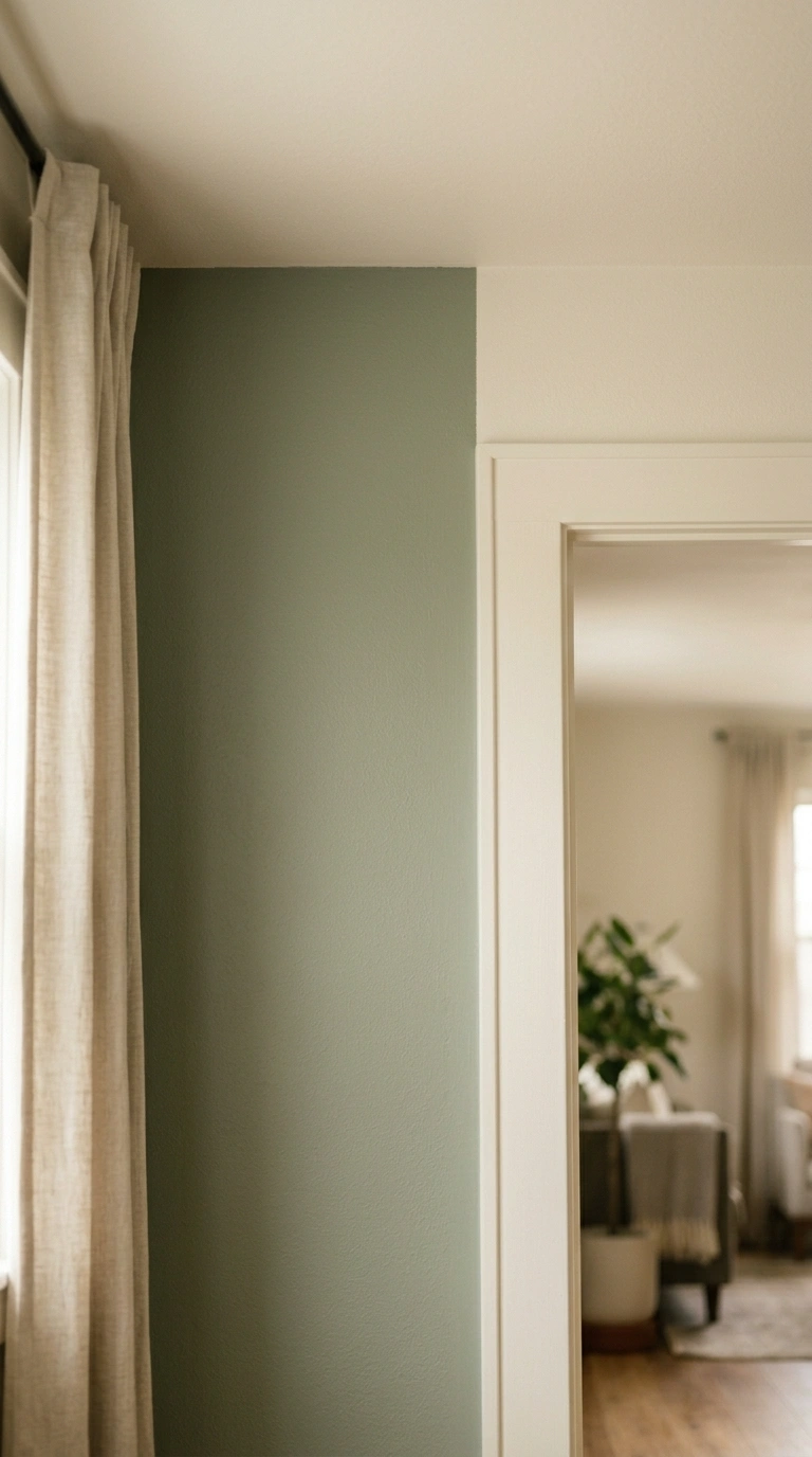
Wavy paint lines and bleed at the corners make a wall look unfinished, and a sloppy wall makes the whole room feel smaller and careless.Tape clean edges and cut a crisp line where color meets ceiling and trim.
Fix: use quality painter’s tape and a steady angled brush for sharp corners.Crisp edges signal care, and a cared-for room always feels more spacious.
14. Letting the Wall Clash With Warm Wood Tones
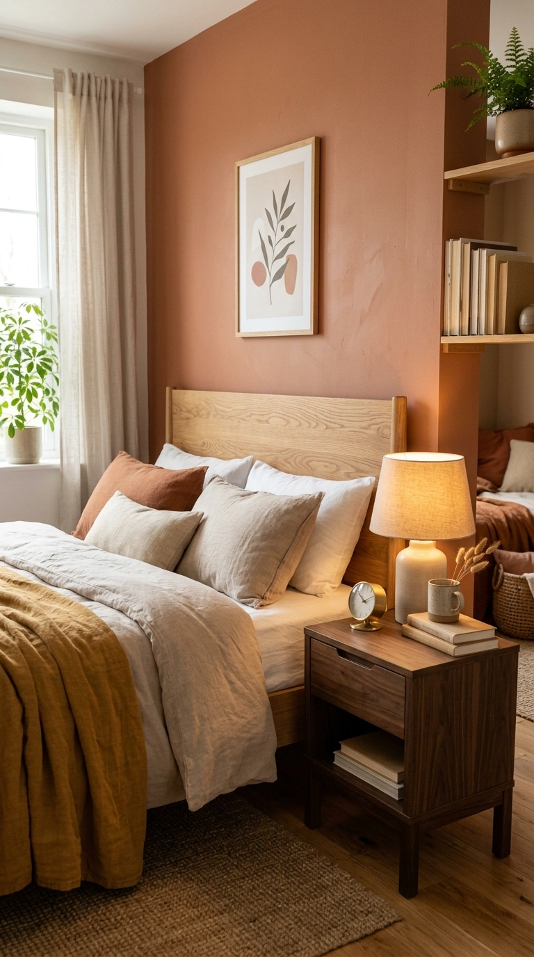
A cool, ashy accent beside honey oak furniture creates a jarring contrast that fragments the room.Choose a wall tone that shares warmth with your wood, like clay against oak or olive against walnut.
Fix: photograph the wood and the chip together before deciding.Shared warmth between wall and wood blends the room into one easy palette.
15. Leaving Every Other Surface Bare and Cold
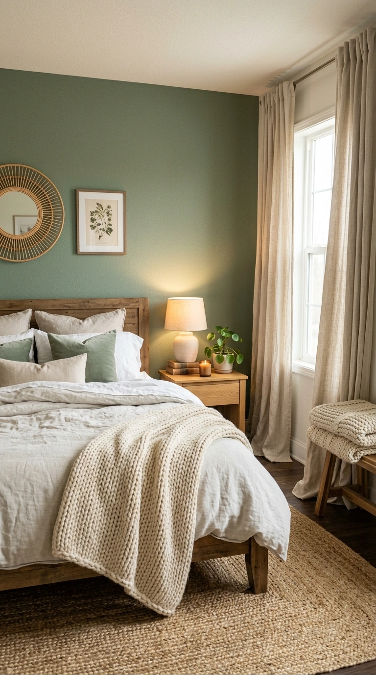
A single bold wall surrounded by bare, hard surfaces feels stark, and stark rooms feel smaller and unwelcoming.
Add soft layers nearby: a jute rug, linen curtains, a knit throw.Fix: echo the wall’s warmth in two textiles so the room feels held together.Two soft textiles echoing the wall keep a bold color from feeling stark.
16. Choosing Peel-and-Stick Paper With Visible Seams
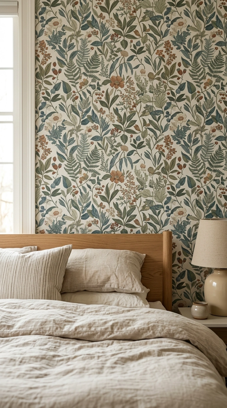
Mismatched seams and bubbles in cheap wallpaper draw the eye to flaws and make the wall feel busy and tight.Buy quality paper, match the pattern at seams, and smooth as you go.
Fix: order one extra roll so you can align the repeat cleanly.Matched seams keep the eye gliding smoothly instead of snagging on flaws.
17. Going Too Bold Without Balancing Soft Textiles
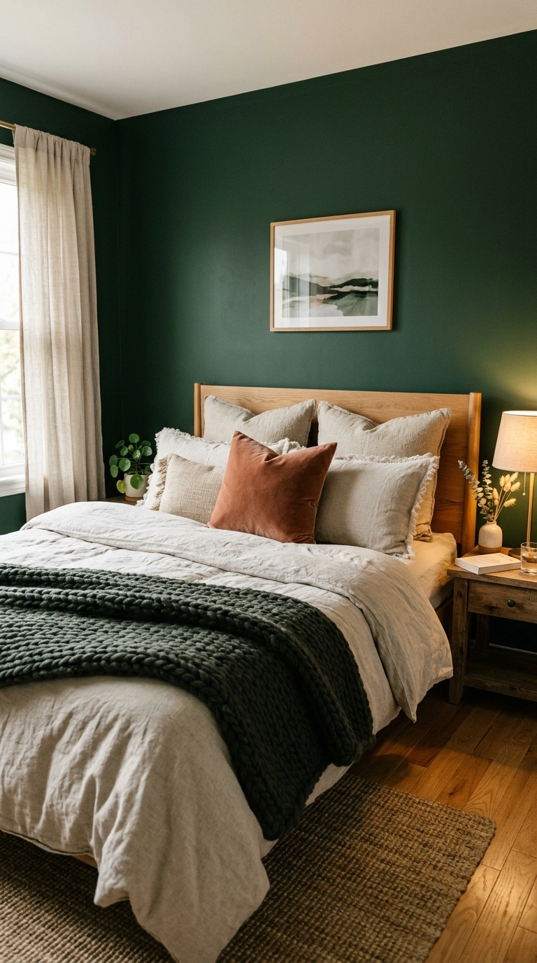
A very saturated wall with crisp, hard bedding feels heavy on one side and empty on the rest, throwing off balance.Counter a bold wall with plush, layered textures in calm tones.
Fix: stack a chunky knit, linen pillows, and a velvet cushion pulled from the wall color.Plush layers soften a saturated wall and spread the visual weight evenly.
18. Ignoring How the Color Reads Against Your Headboard
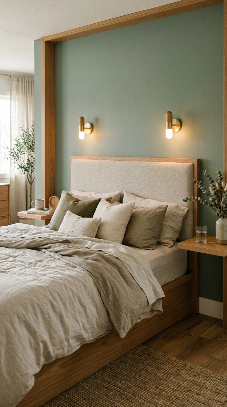
A wall color that fights your headboard fabric makes the bed look stuck on rather than built in, shrinking the focal point.Choose a wall tone that flatters the headboard, like sage behind oatmeal linen.
Fix: hold the swatch against the actual headboard before painting.A wall tone that flatters the headboard makes the bed feel built into the room.
19. Placing the Accent Wall Where a Door Cuts It in Half
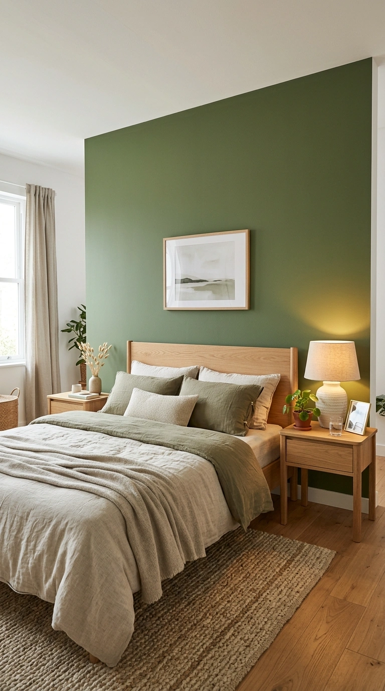
A door slicing through the accent wall breaks the color into odd chunks, and broken color makes a room feel choppy and small.Pick a solid, unbroken wall for the accent.
Fix: choose the wall with no doors so the color reads as one clean plane.An unbroken wall lets the color read as one clean, calming plane.
20. Using High-Contrast Stripes That Shrink the Ceiling
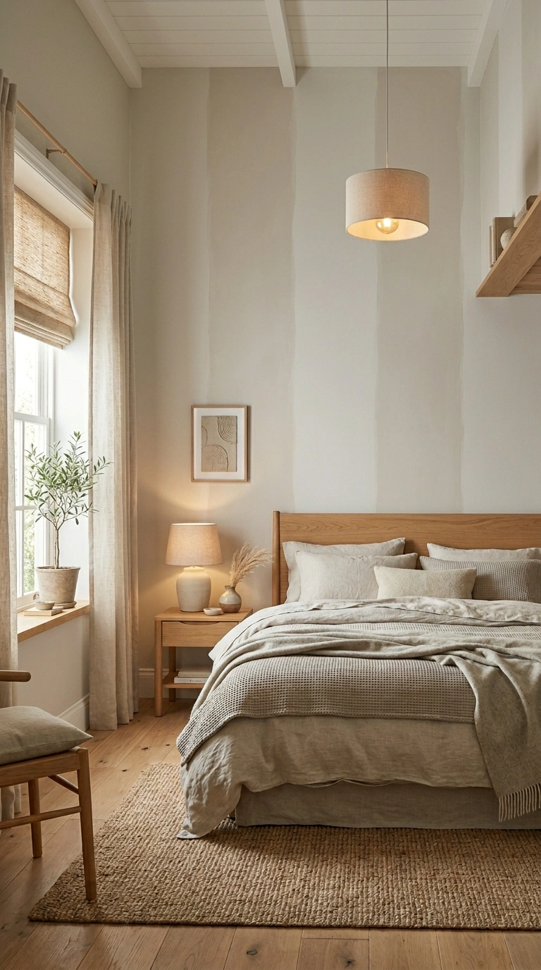
Bold horizontal stripes can widen a wall but often crush the ceiling height and make the room feel squat.If you love stripes, go vertical and tonal to lift the eye instead.
Fix: use thin vertical stripes in two close tones of greige.Vertical tonal stripes lift the eye and add the height a small room craves.
21. Forgetting Lighting, So the Wall Looks Flat and Dull
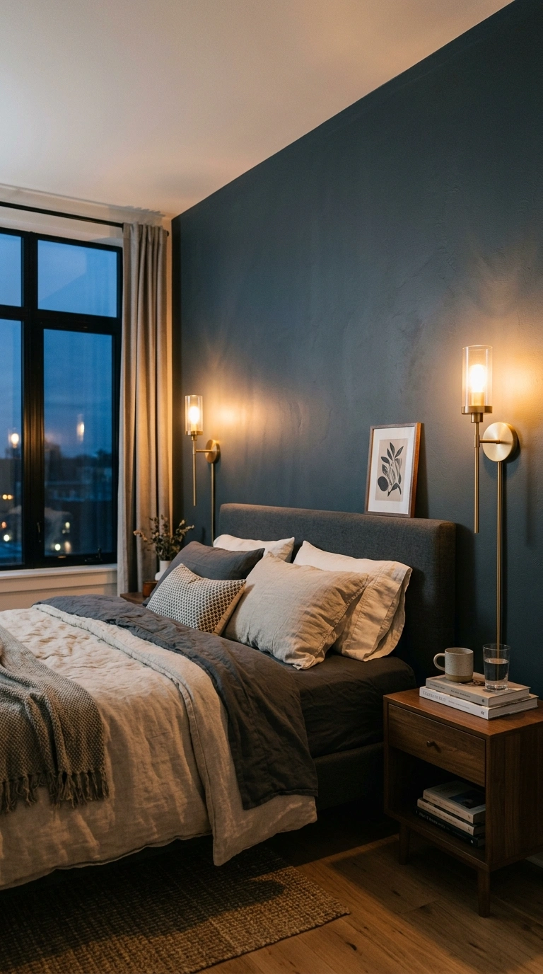
Without good light, a rich accent wall goes flat and gray, and a dull wall makes the whole room feel smaller and tired.Add warm light that grazes the wall, like a picture light or wall sconces.
Fix: install a warm 2700K sconce pair to bring the color to life at night.Warm light grazing the wall brings the color alive and adds real depth.
22. Matching the Accent Wall to Trendy Colors You’ll Tire Of
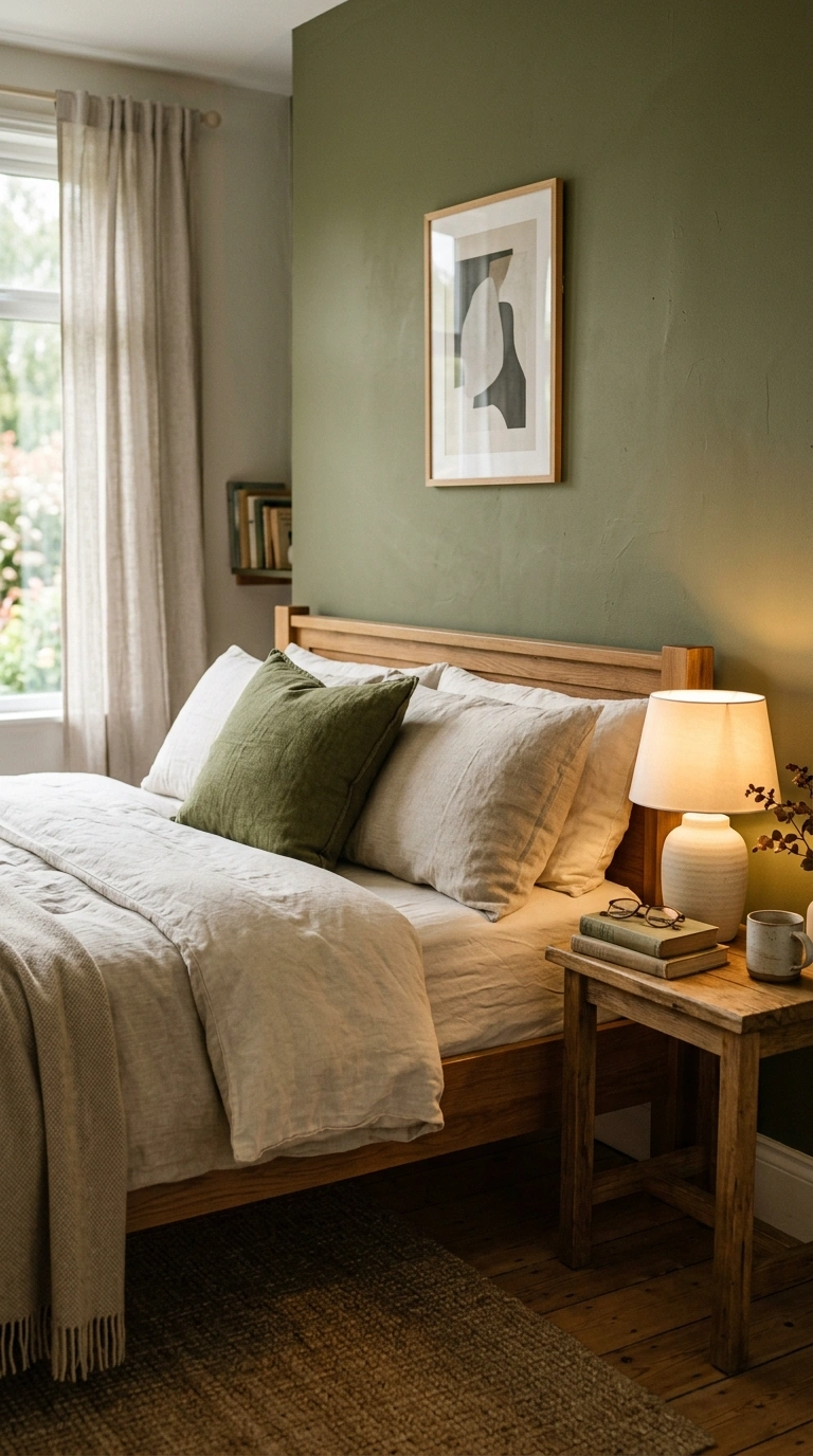
A loud trend color dates fast, and a wall that feels off makes you avoid the room, which shrinks its comfort and use.Choose a calm, lasting tone you respond to personally, not just one you saw everywhere.
Fix: pick a color you already own and love in a textile or print, then commit.A lasting, personal color keeps you happy in the room for years, not months.
Final Thoughts
Most of these accent wall mistakes come down to three things: the wrong wall, a color that fights the light, and too little soft balance around it. Fix those and your bedroom opens right up.
Walk into your room tonight and check the wall behind your bed first. Pin the looks that feel calm and roomy, then plan one clean change this weekend.
Frequently Asked Questions
Q1. Can an accent wall make a small bedroom look smaller?
Yes. The wrong accent wall shrinks a room when it uses a heavy color in low light, sits on the longest wall, or gets crowded with furniture. The right wall, color, and placement do the opposite and open the space up.
Q2. What accent wall color makes a room feel bigger?
Warm, soft mid-tones like clay, greige, and muted olive make a room feel bigger because they add depth without absorbing light. Keep the ceiling and other walls a clean warm white so the accent reads as a calm focal point, not a heavy block.
Q3. Should an accent wall be darker than the rest of the room?
It can be, as long as the room has enough light. A darker focal wall behind the bed adds depth, but in a dim room a warm mid-tone is safer. Always test the shade in evening light before you commit.
Q4. Where should you not put an accent wall?
Avoid the wall you see first from the door, the longest wall in a narrow room, and any wall a door cuts in half. These spots break the color or push a wall forward, which makes the bedroom feel smaller.
Q5. How do I balance a bold accent wall?
Layer soft textures in the room, scale your art to the bed, and repeat the accent color once in a small object. Plush bedding, a jute rug, and warm sconce lighting keep a bold wall from feeling heavy or stark.